Technology has had a massive impact on the web designing world in the past decade. From how we build websites to how we see them — being up-to-date begins with comprehending how new technology helps designers push and exhaust the boundaries of creative artistry.
The thing is — web designing comes down to looking to the future. Due to its association with tech, the digital sphere can demonstrate innovations in animation, interaction, and immersion in general, every new year. And 2022 has a lot to look forward to, as we’ll soon see in this article.
The 80s and 90s are swinging back in action. Typography is taking the lead. Live animation is skyrocketing to massive new heights. Meantime, visual styles run the gamut from mind-blowingly advanced technology to whimsically handcrafted.
2022 is coming to be a wide-ranging and experimental beginning in digital diaries. Before we jump into the brand new year, let’s go over the top 8 powerful trend shifts approaching us this 2022.
1. Retro Fonts
We have witnessed a ton of old-school things returning as cool items. And after some time, they get even more un-cool—for example, mom jeans and handlebar mustaches. The irony comes with a small expiry date.
Retro fonts faced this rise and fall of popularity, and many designs with old-school typography didn’t age well.
That said, throwback typography has made a comeback. Traditional decade-old fonts are returning with new shades and a unique fresh appearance. We’re not witnessing the same used-to-death fonts all the time. Instead, stylization and a little creativity are re-introducing what retro fonts could be.
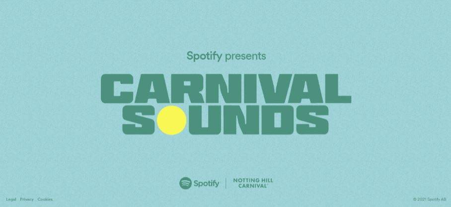
You can notice this fusion of old and new on Spotify’s Carnival promotion page.
Rather than making it dry and boring, they injected life into typical bold fonts with some experimentation. It’s an excellent instance of taking generally used fonts and offering a cutting-edge spin while keeping it easy to read. The bold vibe makes it a bit old-school yet feels very up-to-date.
To sum it up, here’s an overview of the advantages of old-school fonts in web design:
- Advocating the site’s style: Be it traditional or minimalist, grid layout or split-screen, there are wide-ranging retro fonts that can help support or emphasize all styles. What’s more, old-school fonts can transform into the focal point of your design style.
- Garner attention: Old-school fonts aren’t the widely-used generic fonts. Rather, such retro fonts incorporate a different vibe to your site. And that’s certain to capture the attention of the prospects and keep them intrigued. That means they’ll be more prone to read your content rather than scan through.
- Small details: Although certain retro fonts use bold, clean lines or even a stencil effect, others depend on minor details to attract attention. Such little details may not fit a minimalistic site; however, they might bring visual interest to other designs and help the brand stand out.
- Bold and defined: You can find retro fonts that are bold and well-defined. They can help scream and ensure your message is conveyed.
2. Parallax Scroll Animations
Parallax scroll animations remained a web design trend for years. In 2022, chances are, we’ll see more minute and creative twists of what you can do with parallax.
In simple words — parallax is an optical illusion that we see in our day-to-day lives. This occurs when closer objects appear to move faster than remote objects. This particular effect looks surreal as well as real on website pages.
The mixed-use of foreground and background for developing depth benefits from immersion. It makes your computer screen more like a theatre stage. Because users surf through the site pages, they see the performance as magical.
Keep in mind — excessive movement in parallax effects could turn out to harm people suffering from vestibular disorder since the effect of movement and depth can cause dizziness and disorientation.
Below are a few guidelines to ensure minimal use of parallax while causing no harm.
- Avoid diverting from the essential info despite the effects
- Avoid making it more difficult for the user to finish crucial tasks
- Minimize the number of parallax illusions
- Reduce the number of parallax movements as much as you can
- Constrain parallax effects in a little area of the screen
- Add the option for users to switch off parallax illusions
Not all parallax animations need to make big gestures across the screen. There are also more subtle uses. In the coming year, we’re excited to witness the use of subtle parallax scroll effects. Not exactly for flashy effect, but to highlight important parts of the content.
3. Horizontal Scrolling
Formerly known as a web designing faux-pas, this practice is making its return as more and more web designers are testing out horizontal scrolls. And it’s not just a web design attempt to be different from others. It also helps to disclose secondary information steadily, similar to an image gallery.
Web designers planning to use horizontal scroll in 2022 must keep these in mind:
- Do not force the audience to navigate through horizontal content. Have navigation alternatives. For example, buttons containing clear labels.
- Apply clear-cut visual cues to imply where content uses horizontal scroll. Avoid secreting them behind hovers.
- Be considerate regarding which content would find helpful from being shown in a horizontal scroll. Photo galleries are an excellent contender as a horizontal scroll would show users a little preview and offer them the choice to view more or keep scrolling down the page.
- Don’t require a horizontal scroll for the text that’s important to be read.
Memento Design Studio’s homepage has a clear-cut cue beside the main button. It also works like a link that slowly slides you over to the featured works on click. The scroll motion is rightly paced and not excessively long. It allows the featured images to shine.
When you’re using horizontal scrolling, it’s important to understand why you’re altering default scrolling behavior and how it’s enhancing user experience. When you’re making a user scroll horizontally, you’re willingly pushing against what the visitors usually want to do. So ensure you have a good reason behind the cool look.
4. Augmented Reality (AR) Experiences
Let’s not overlook the fantastic immersive experiences augmented reality brings to the table. AR today is more than just looking for Pokémon on your smartphone device. Newfound tech like the WebXR API and software created by Wayfair Technologies has opened up this domain for about everyone.
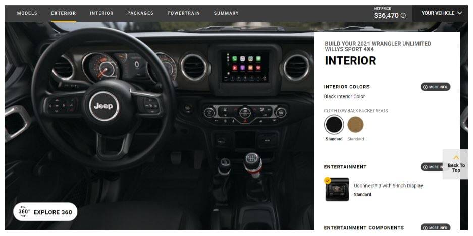
An excellent example would be the “Build & Price a Jeep” page.
For people who don’t like to go to car dealerships in real life, this brings them a pressure-free, almost effortless experience. More and more retail and eCommerce sites are utilizing the power of augmented reality to sell their items and help prospects in the buying journey.
5. Bold Fonts
First, we saw harsh white, and next came the inky-black dark mode. Nowadays, designers are opting for vibrant colors — from the extremely warm to color-clash palettes that are super attention-grabbing.
The truth is — web design will involve many more fonts in 2022. Although serif and san-serif fonts are still super popular, the old-school type is returning in branding all of a sudden.
And it makes sense too. Think about it. If you give someone 10 minutes to consume content, won’t most people be attracted to something beautifully designed over something dry? Adding bold colors into the mix is an excellent way to give your content beauty.
If you look at many leading corporation sites, you’ll find that bold typography is in full swing. You’ll see the outlined and bold kind showing up in many places — be it brand names or landing page headings — where the most notable type of trend is screen outshining the text.
Thanks to bold heavyweight fonts, you can convey your message instantly, not the imagery necessarily. Fusing such large fonts with neutral colors strengthens the headlines further, quickly turning into an “image” of their own.
Be sure to select a typeface matching your brand, audience, and company goal. Also, choose an easy-to-understand typeface for the body text because it’ll help improve the website’s user experience. A simple, easy-to-read font like Arial is an excellent pick.
Aside from bold colors, we also witness the rising usage of abstract shapes as an alternative to illustrations or photography. Things like lava-lamp blobs, nature-inspired formations, and Pollock-esque splotches. Such designs emanate freedom and energy on the screen.
6. Dark Mode
The dark mode is something almost all of us can vote for, right? Be it a theatre or mobile app, it’s something you love.
Dark mode web designs come with a few varied functions. On one end, they minimize eye pressure, which is a concern for many people as our screen time is on the rise. From the aesthetic viewpoint, dark mode births a cutting-edge appearance for the website while offering the ability to emphasize other design elements simply by blackening the elements surrounding it.
Dark mode would come with solid usage of screens in 2022. More and more designers opt for the dark mode elegance because black offers the ideal dark backdrop to make design elements look catchy on screen.
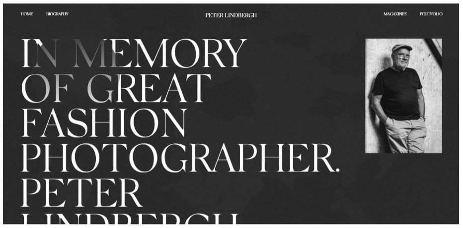
Obys Agency built a gorgeous tribute to fashion designer Peter Lindbergh in the instance below. Combining a subtle-textured black background with a gorgeous serif font.
To sum it up, here are the main reasons to embrace this trend:
- Dark mode helps save battery life
- It offers your device a cool and up-to-date look
- Dark mode doesn’t pressure your eyes in low-light surroundings
7. Use Of Audio
Could audio add value to your site? Auto-play audio is one of the most annoying online experiences, but let’s not write it off entirely yet. Providing audio as an integrated design part eliminates accessibility barriers for people with visual impairments. It also helps people who like to listen to a big chunk of content on a site. Thereby increasing the website’s dwell time. Per statistics, the average session duration is about 3 minutes. Thanks to audio, you could easily increase that as the mesmerized audience stays to listen.
That said, it must be used sparingly, within context, and the visitors must have control — meaning, the audio is muted in the beginning, so the user can decide whether to play it or not. There are good chances we’ll see more audio options on sites next year. Offering people a choice in regards to how they wish to experience content.
8. Illustrations
Some time ago, websites used to contain only some images or graphics. But web design has transformed, as designers are developing work that resonates with people on a more personal level.
Illustrations have got popular as a method of transforming sites with a solid sprinkle of humanity. Illustrations are fun-to-watch, appealing, and sort of relating to the audience’s mood as well. It offers you refreshment and joy. That’s because, on the web, sometimes it feels like we’re finding the same stock images in several places. It makes a site feel boring, bland, and generic. What’s more — illustrations can capture things that photographs simply can’t.
In short — illustrations inject life into your dry projects. There are a ton of sources and artists creating amazing illustrations. Here are a few fantastic illustration resources:
- Humaaans
- Drawkit
- Avataaars
- Blush
- Open Doodles
- Stubborngenerator
Customized illustrations come at a cost – artists must be hired – but they hold the power to transform the style of the website and create an entirely new experience. Customized illustrations frequently feel playful while communicating things about the brand.
Closing Thoughts
The best web designing trends have developed across the years. Certain trends for 2022 are new, and some are transformations of the past trends. All in all, it’s not all about getting gimmicky and more about offering the best user experience to create an excellent customer buyer journey.
Feel free to add some of the above design trends to the website as part of a timely makeover, or maybe, a more comprehensive design overhaul.
EWR Digital | Design Accredited Agency
