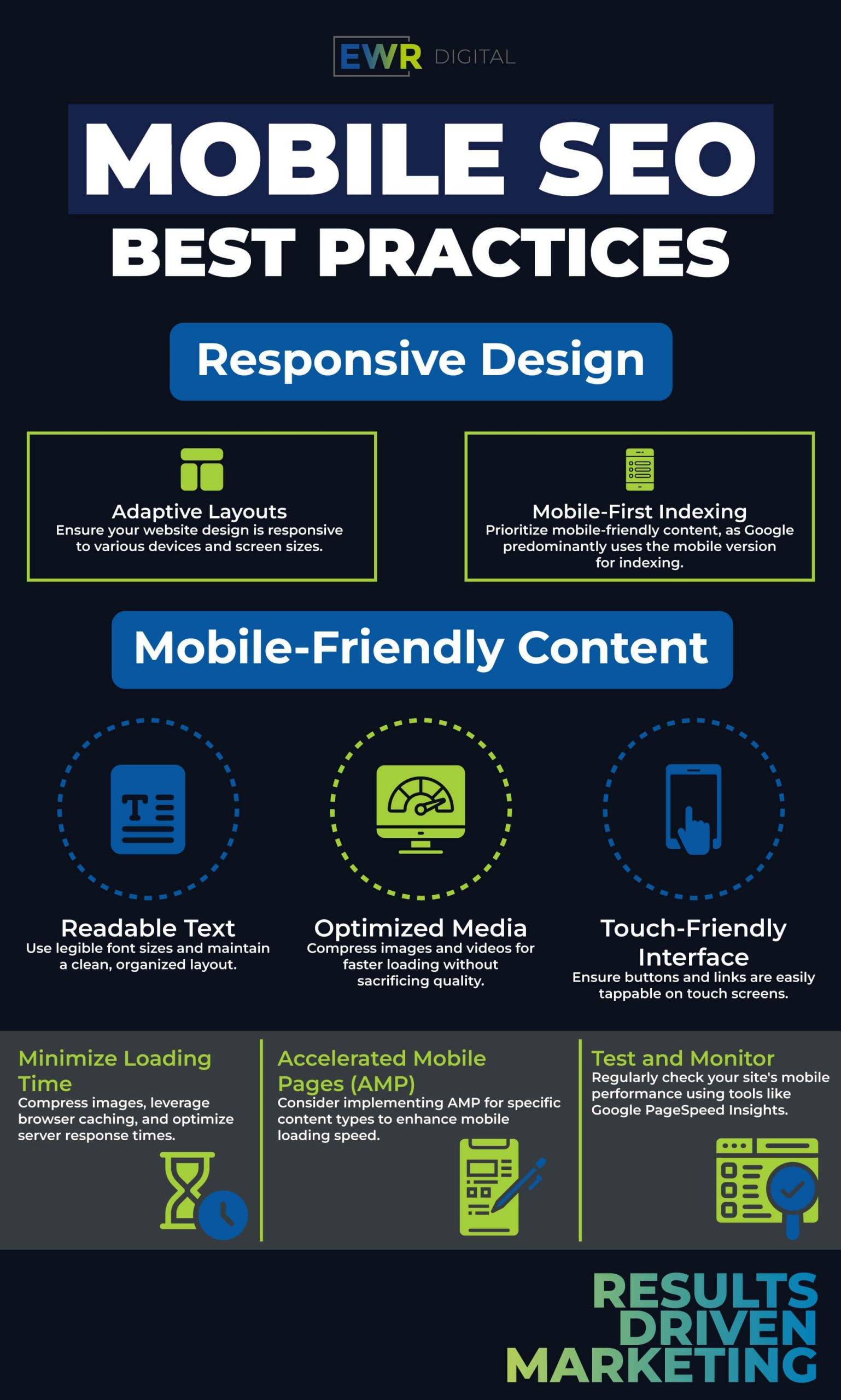
Responsive Web Design: A Step-by-Step Guide
In today’s digital landscape, where users access websites on a myriad of devices, creating a responsive web design is not just a trend—it’s a necessity. Responsive design ensures a seamless and consistent user experience across various screen sizes and devices, from desktops to smartphones. In this step-by-step guide, we’ll explore the principles of responsive web design and provide practical insights into creating layouts that adapt gracefully to the diverse needs of your audience.
Understanding the Foundation: What is Responsive Web Design?
Responsive vs. Adaptive: Distinguish between responsive and adaptive design approaches. Understand the advantages of responsive design, where a single codebase adapts dynamically to different screen sizes, resolutions, and orientations.
Mobile-First Philosophy: Explore the mobile-first approach, a strategy that prioritizes designing for smaller screens first. Understand how this mindset can lead to more efficient, streamlined, and user-focused design processes.
The Building Blocks: Key Components of Responsive Design
Media Queries Demystified: Delve into the core of responsive design with media queries. Learn how to use CSS media queries to apply different styles based on the characteristics of the device, such as screen width, height, and orientation.
Flexible Grids and Layouts: Discover the power of flexible grids and layouts using tools like CSS Flexbox and Grid. Explore how these techniques allow content to adapt proportionally to the screen size, maintaining a harmonious layout across devices.
Fluid Images: Ensure images scale gracefully with the layout using fluid images. Explore techniques such as setting maximum widths and using the max-width property to prevent images from exceeding their containing elements.
Practical Implementation: Step-by-Step Guide
Setting Viewports: Understand the importance of setting the viewport meta tag to control the width and scaling of the viewport, ensuring optimal rendering on various devices.
Breakpoints for Different Devices: Identify breakpoints in your design where the layout needs to adapt. Discuss common breakpoints for devices like smartphones, tablets, laptops, and desktops, and implement corresponding media queries.
Testing Across Devices: Explore testing strategies to ensure your design functions seamlessly across different devices and browsers. Utilize browser developer tools and online testing platforms to identify and address any responsive design issues.
Advanced Techniques: Going Beyond the Basics
Responsive Typography: Learn how to create typography that adjusts based on the screen size. Explore techniques like fluid typography and the use of relative units to ensure readability and aesthetics on all devices.
Optimizing Performance: Discuss strategies for optimizing performance in responsive designs. Cover topics such as lazy loading images, conditional loading of assets, and minimizing HTTP requests for faster page loading times.
Accessibility Considerations: Understand the importance of accessibility in responsive design. Discuss best practices for ensuring a positive user experience for people with disabilities across all devices.
Beyond the Basics: Future-Proofing Your Responsive Design
Embracing Progressive Enhancement: Explore the concept of progressive enhancement, where you start with a baseline functional design and progressively enhance it with advanced features for devices that support them.
Keeping Up with Evolving Technologies: Web technologies are ever-evolving. Discuss strategies for staying informed about the latest advancements in responsive design, such as CSS Grid Level 2 and container queries.
Crafting User-Centric Experiences
Responsive web design is not just about layouts; it’s about crafting user-centric experiences that adapt to the diverse ways users interact with the web. By following this step-by-step guide, you’ll be equipped with the knowledge and practical insights needed to create responsive designs that shine across devices, ensuring your audience receives a consistent and enjoyable journey, regardless of the screen they use. Elevate your design skills and embark on the path to responsive excellence!

